Empowering Doctors with Web and App USMLE Exam Prep
Role
Sr. UI/UX Designer
Duration
June – September 2022
Platforms
Mobile · Desktop · Tablet
Impact
40% → 85% satisfaction
Project Goals
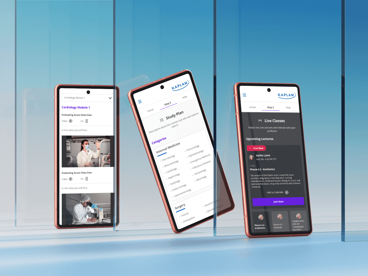
Kaplan's USMLE Step 2 platform was struggling — student satisfaction had dropped to 40% and the interface felt cold and outdated. The team responded with a full research-backed redesign targeting an 85% satisfaction score.
The project covered the full design lifecycle: discovery, stakeholder workshops with medical professionals, two-phase user interviews, and a complete structural and visual overhaul delivered across desktop and mobile.
Process
Research - led
Student - Centered
01.
Stakeholder Workshops
Facilitated workshops with medical professionals to align on pain points, priorities, and design direction before any design work began.
02.
Two-Phase User Interviews
Conducted interviews on the current platform, then repeated with the new prototype — measuring real perception shifts across both rounds.
03.
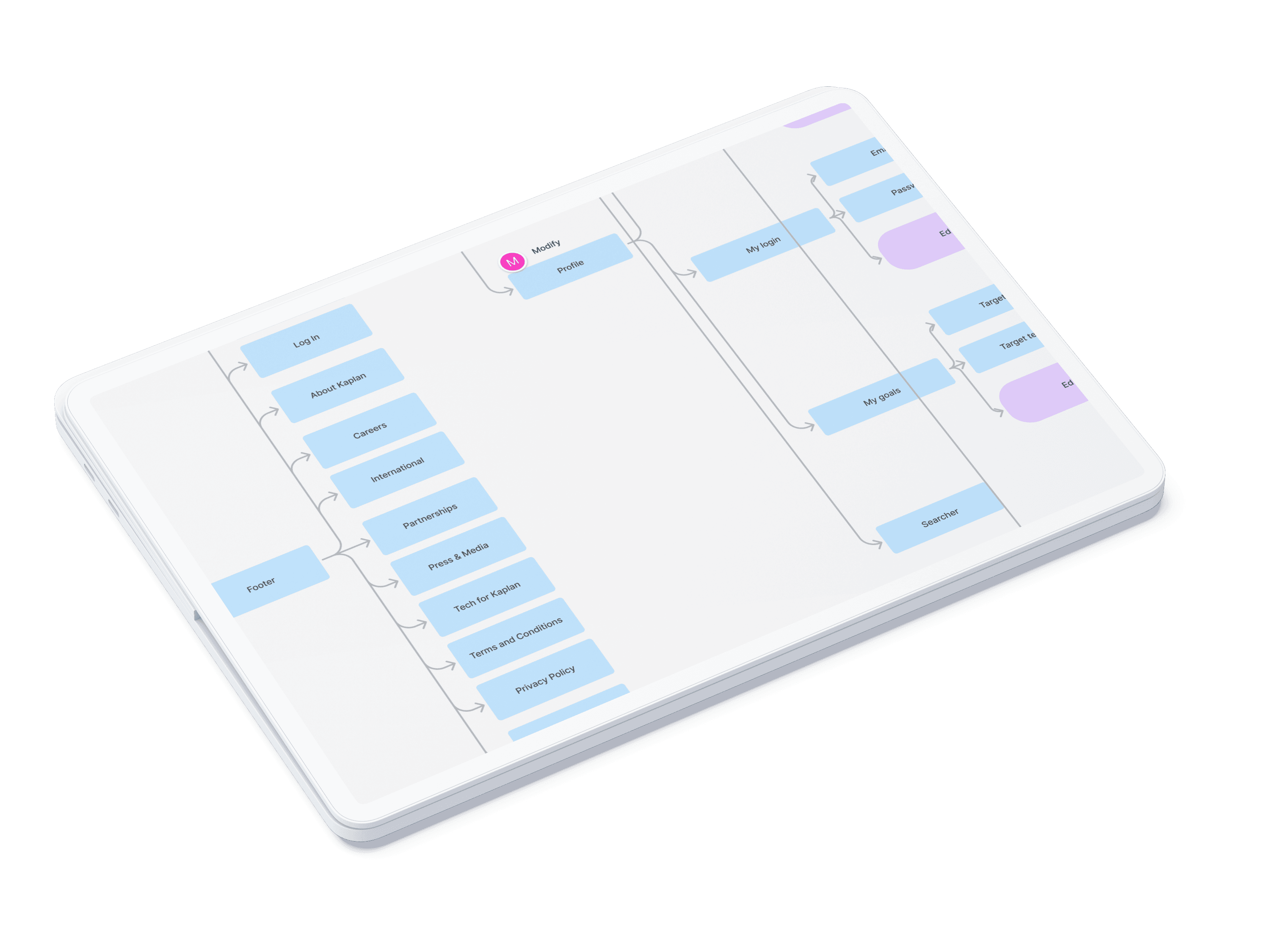
Information Architecture
Restructured the entire IA to surface hidden content and create intuitive study pathways for exam-focused students under time pressure.
Design Highlights
Warmth as a design decision.
Visual Overhaul
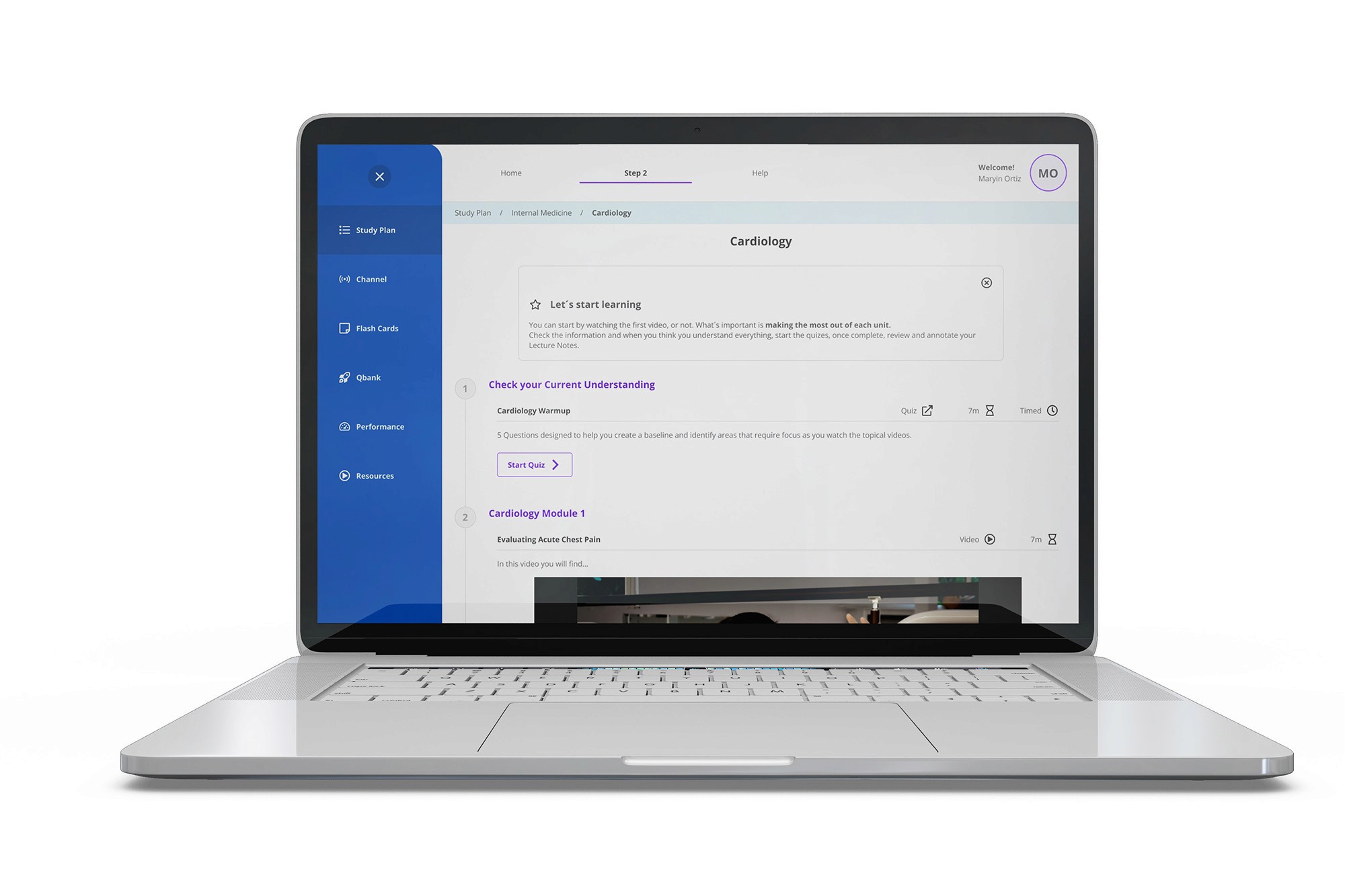
Replaced cold institutional blue tones with an energetic, youthful palette — adding purples and warmer accents to make the study environment feel motivating, not clinical.
Onboarding & Calendar
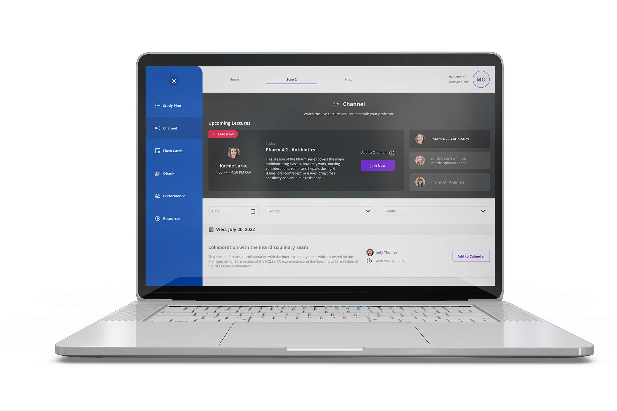
Built structured onboarding flows and Google Calendar integration so students could plan their study schedule directly within the platform from day one.
Progress Indicators
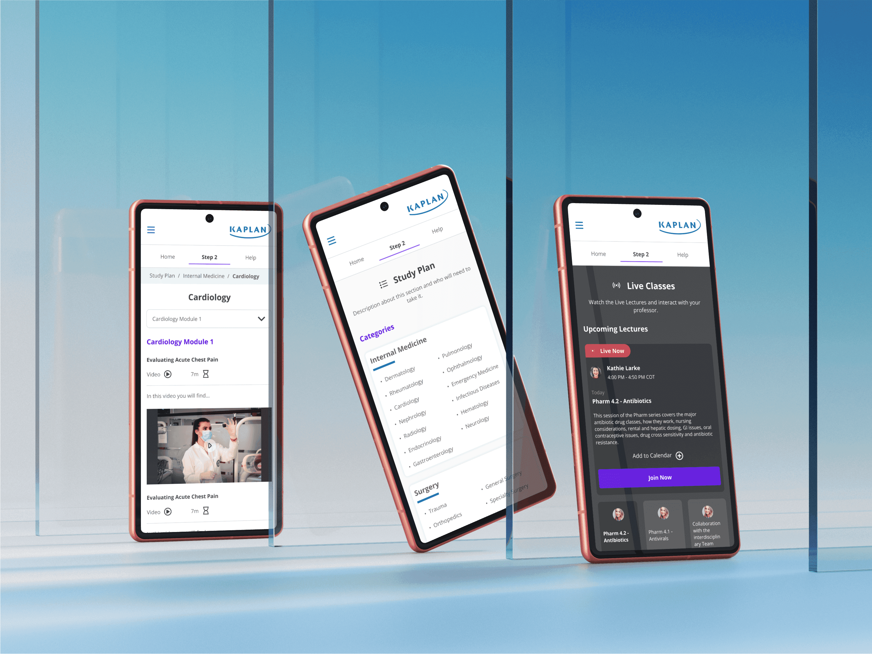
Video progress tracking and completion checkmarks gave students clear feedback on study momentum — the top-requested feature across both interview rounds.
Usability Testing
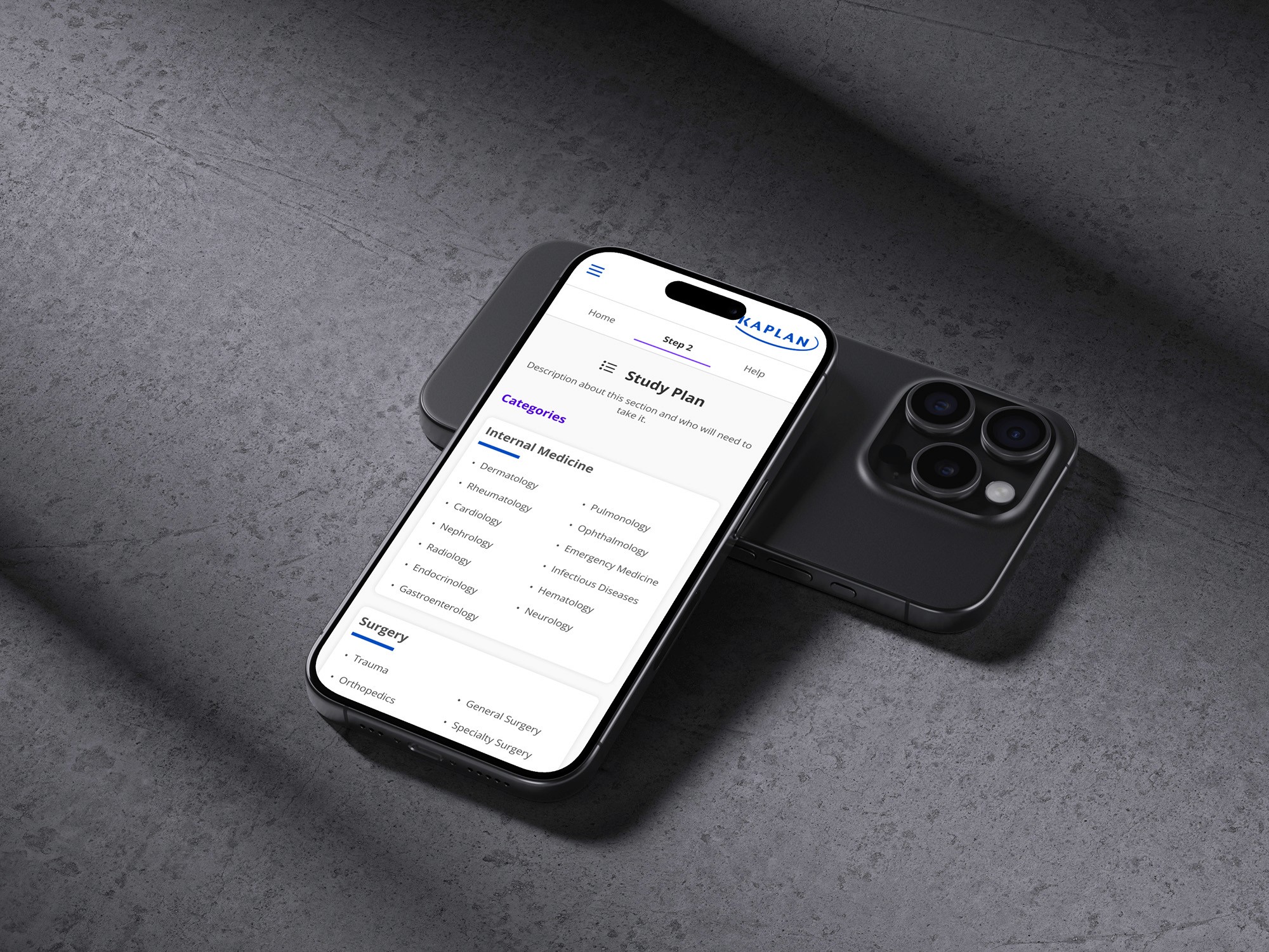
Six participants (3 mobile, 3 desktop) tested the prototype. Study plan navigation, the calendar feature, and improved information structure were universally praised.
Challenges &
Motivations
Research & Learning about Medical Campus
At the outset, it was crucial to learn and become familiar with medical terminology. Therefore, we decided to explore references and review previous research in Kaplan, which helped us to become comfortable with the product.
Negative Insights
Once we had gained a comprehensive understanding of the platform, including its closest competitors, and the interface design, we began conducting user interviews. Some of the key negative insights we gathered were that the platform lacked user-friendliness, was "cold", and lacked intuitiveness.
Positive Insights
However, we also discovered some positive insights. These were mainly related to the classes; users expressed a strong preference for the live lectures and praised the quality of the professors. Additionally, they appreciated certain sections, such as the Q-bank, where they could practice test questions.
Prototyping for
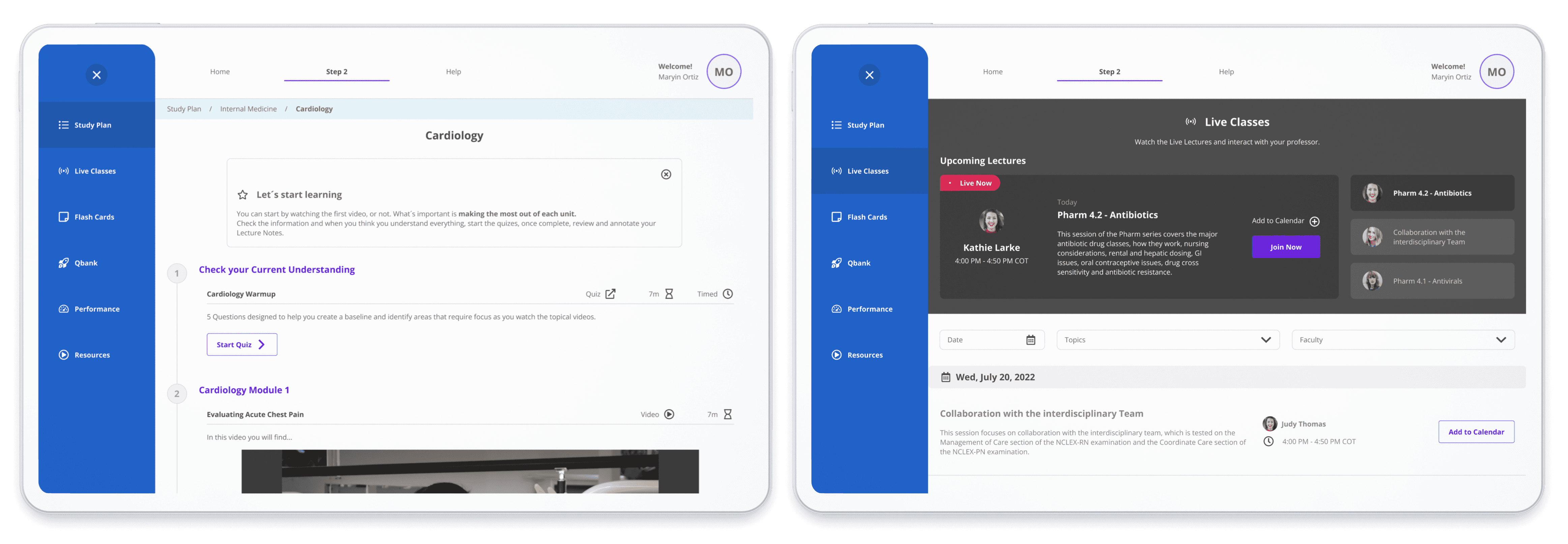
Desktop
For these mockups, we took into account the existing Kaplan Design System. However, we made some modifications based on feedback from users and stakeholders. To make the platform feel less "cold," we adjusted some colors; for example, we replaced the old blue with a more energetic and youthful shade. We also incorporated purples, animations, hover effects, and changes in contrast.
Prototyping for
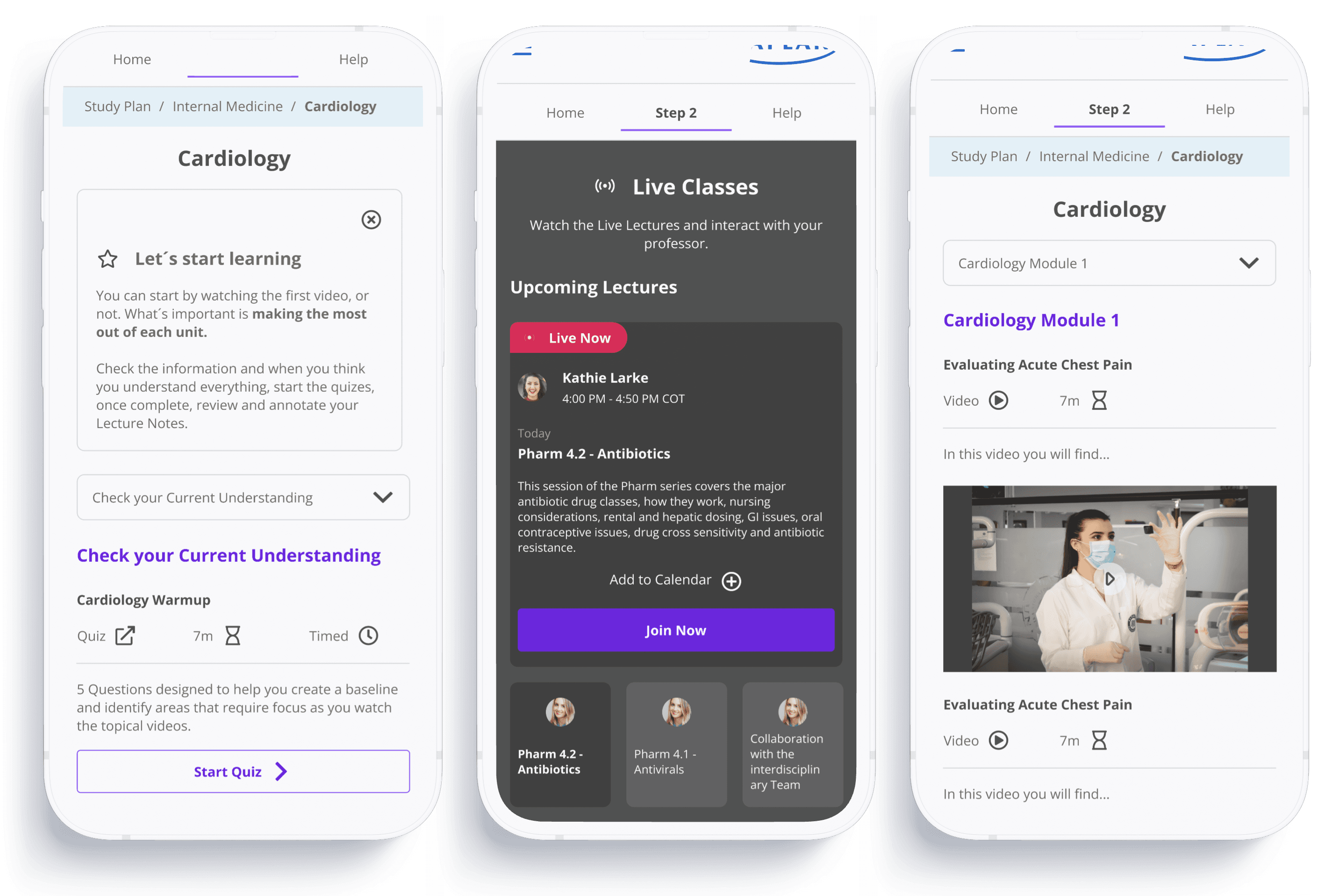
Mobile
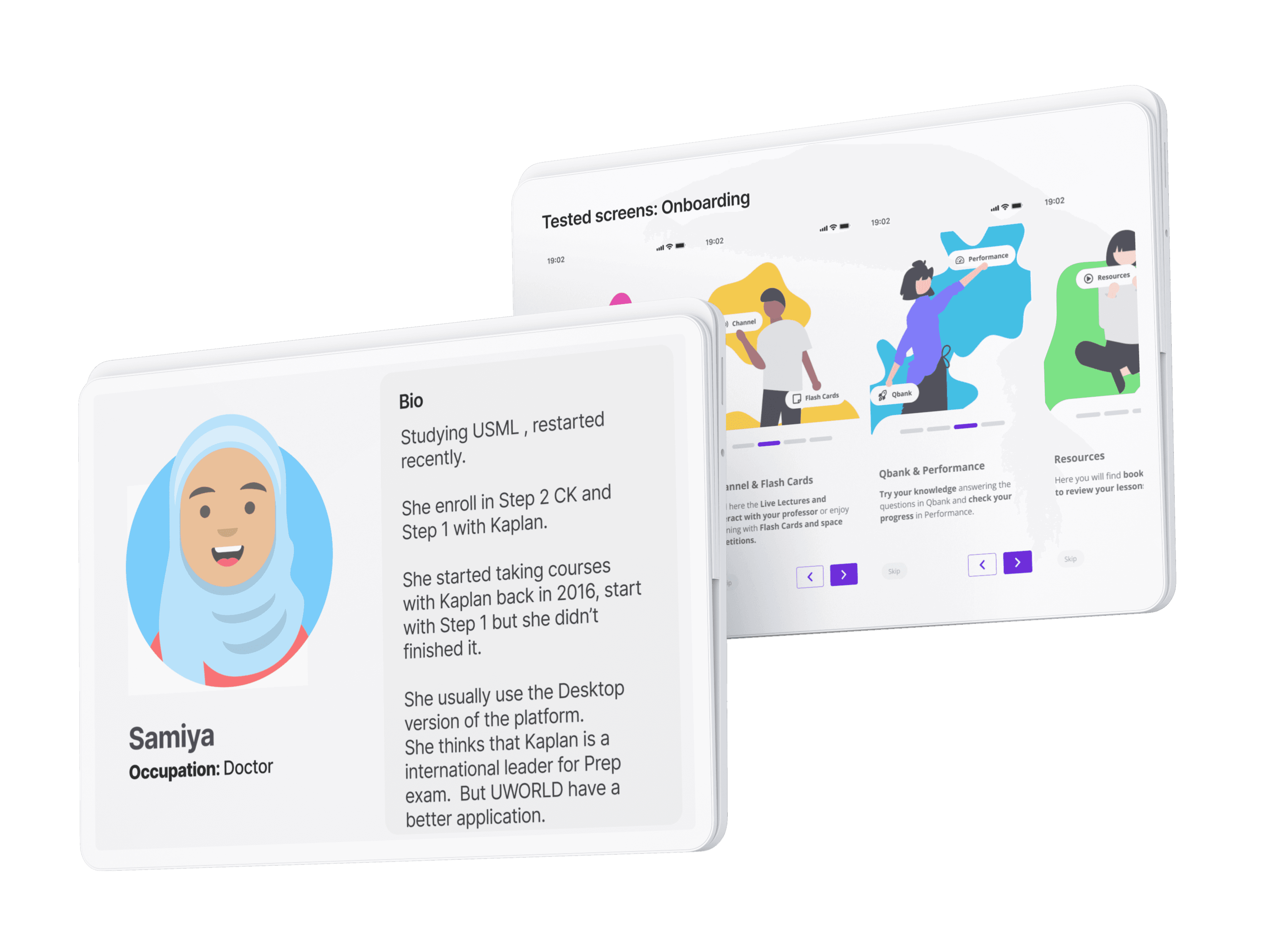
Other features that we decided to include in both versions were an onboarding process for new users, where they could explore the content available in each section, integration with Google Calendar to schedule and remind users of live classes, and visual indicators to track user progress within the videos.
Building the
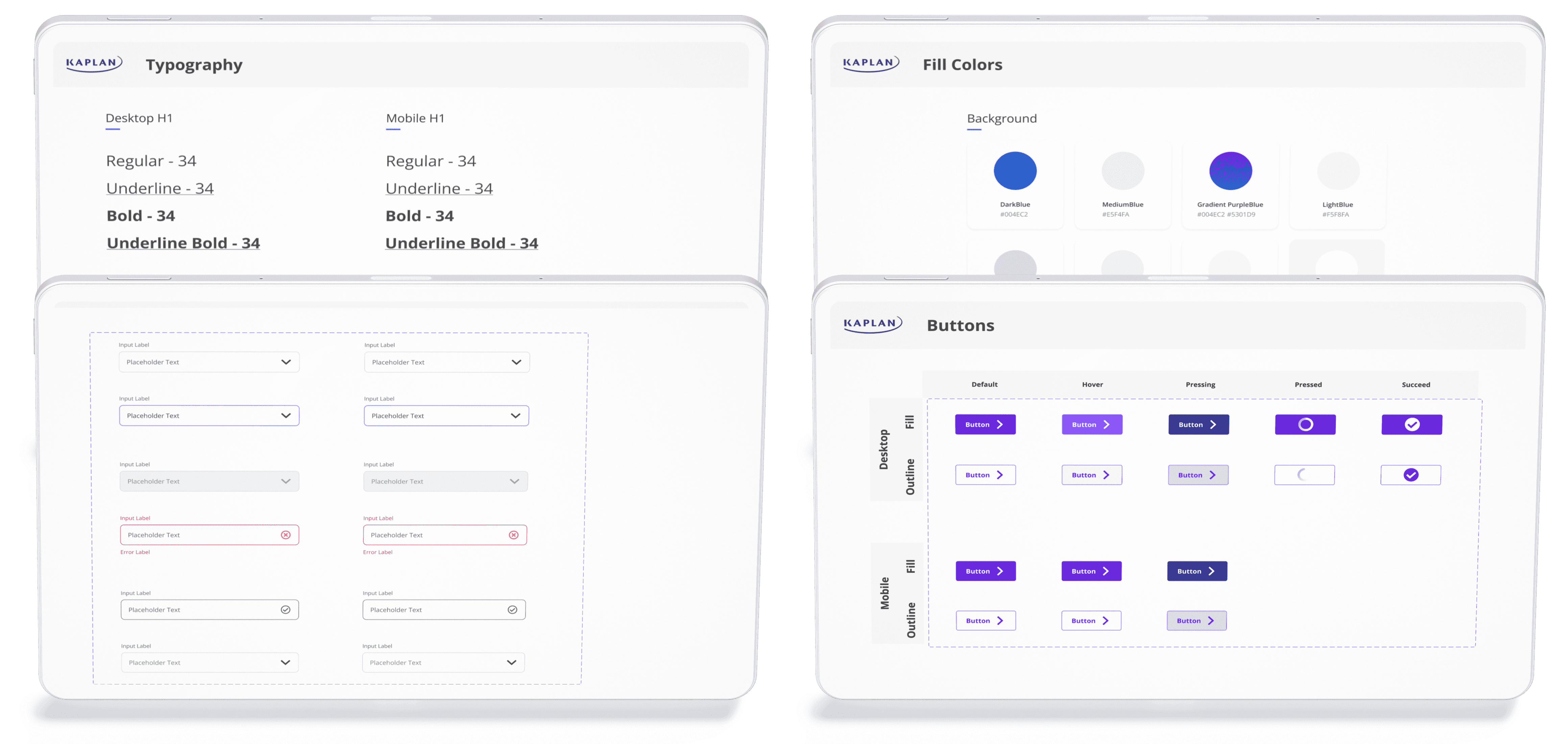
Design system
Kaplan already had a foundational design system, so this project wasn't built from scratch. I enhanced the existing system by adding new colors, modern typography, and animations, and created exclusive assets specifically for the 'Step 2' project.
We are almost finished. If you've reached this point, I sincerely appreciate it. This project has been an incredible journey, with talented individuals like Mathias and Lexie contributing every step of the way. I truly value each contribution and am proud of the final result.
Working with
Real users
New Users
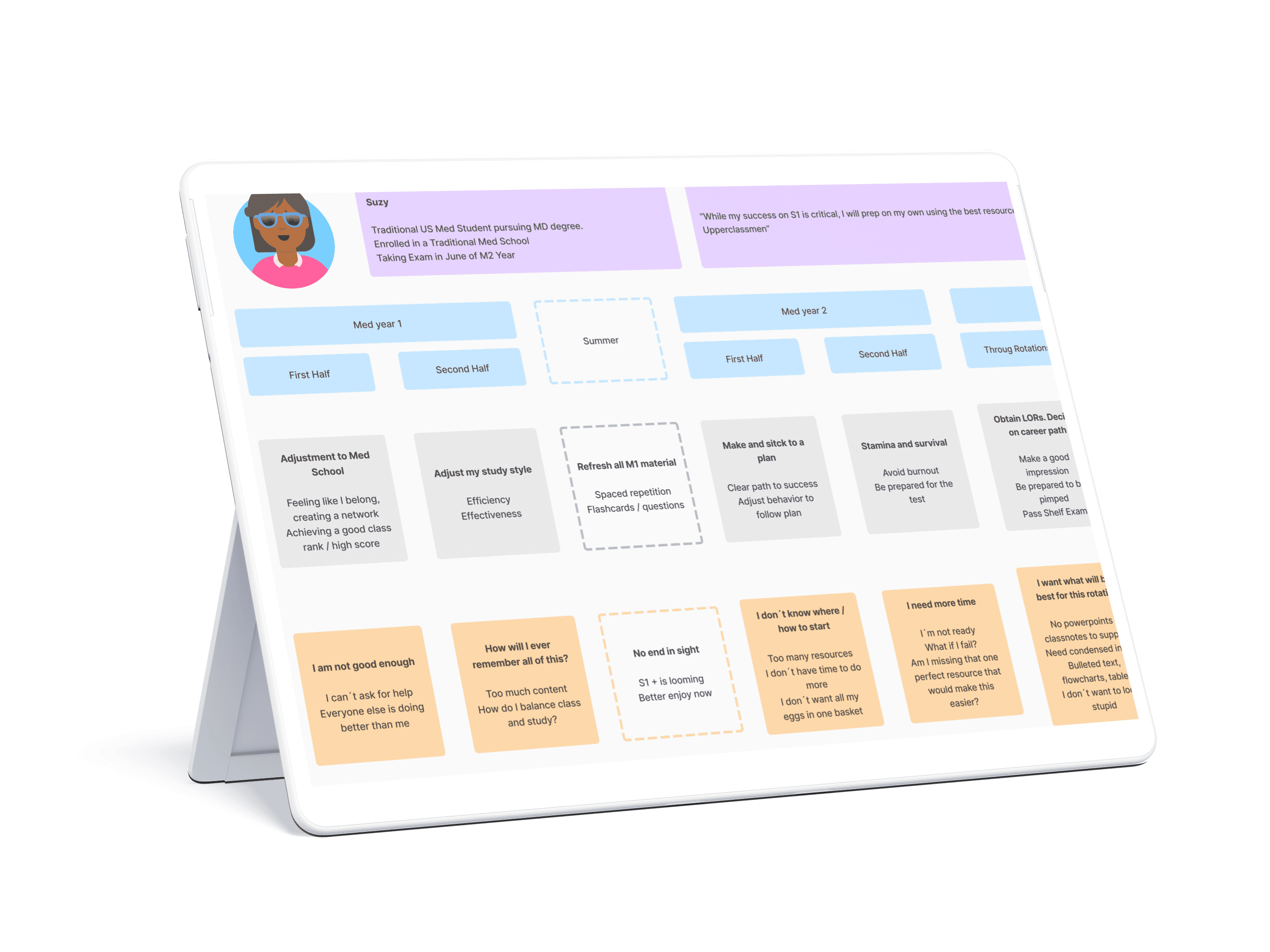
After creating the mockups and a functional prototype, we decided to conduct usability testing. This involved having users navigate the current version of the prototype to gather more insights. We selected different participants for this test to avoid biasing the results of the investigation.
Testing
Due to time constraints, we conducted testing with 6 users: 3 on mobile devices and 3 on desktops. You might be wondering why we tested both platforms. The reason is simple: we wanted to ensure that this new experience was easy to understand on both devices, rather than focusing solely on one.
Synthesis &
Retrospective
Outcomes & Metrics
What we did well
What I would improve
Final design
More work
you might like